Book Cover
Programs: Adobe Photoshop
Project: The Adventures of Sherlock Holmes
Purpose: Book Cover Design
Year: 2020
Goals and Objectives
This project aims to digitally create a new cover for a classic book through photomontage techniques, to make it more attractive to younger readers.

Research + Planning
Starting with mind mapping, I began my initial mind map by looking at the narrative of Sherlock Holmes, including essential characters and locations. Then I experimented with some sketches to see what direction the cover would take. Finally, I made a second mind map to gather my photo assets of the images, typefaces, and colors I wanted to use for the photomontage and arranged them in accordance with the final sketch.
Mind Maps
Design Process
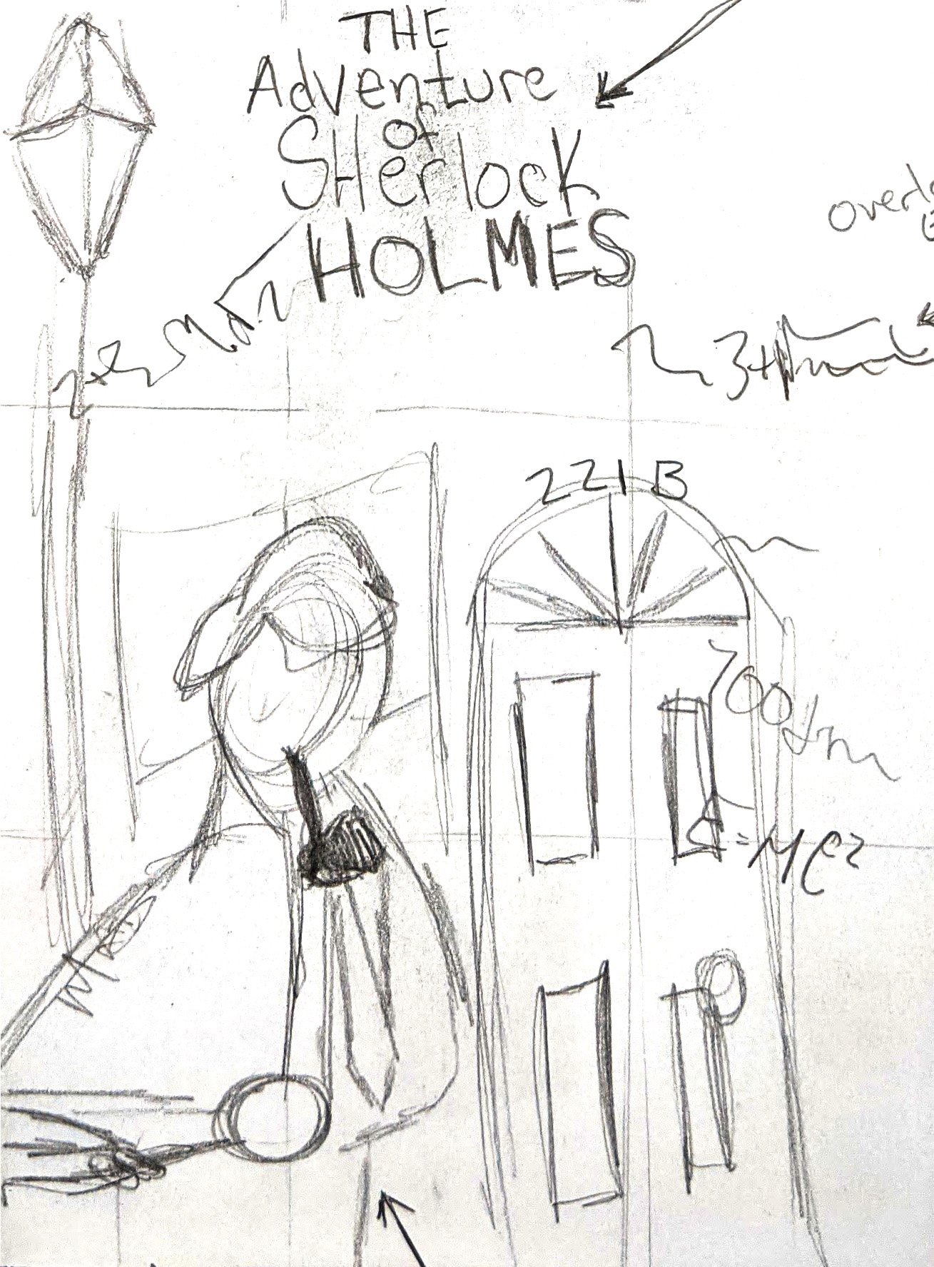
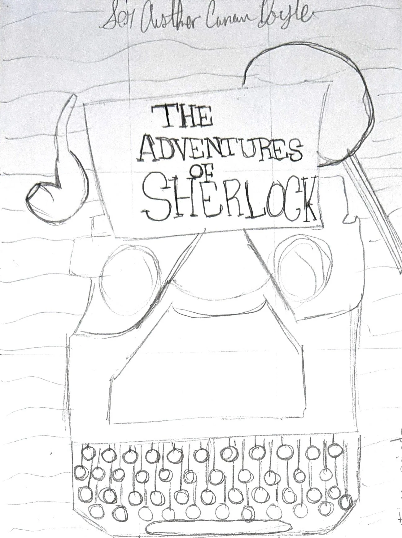
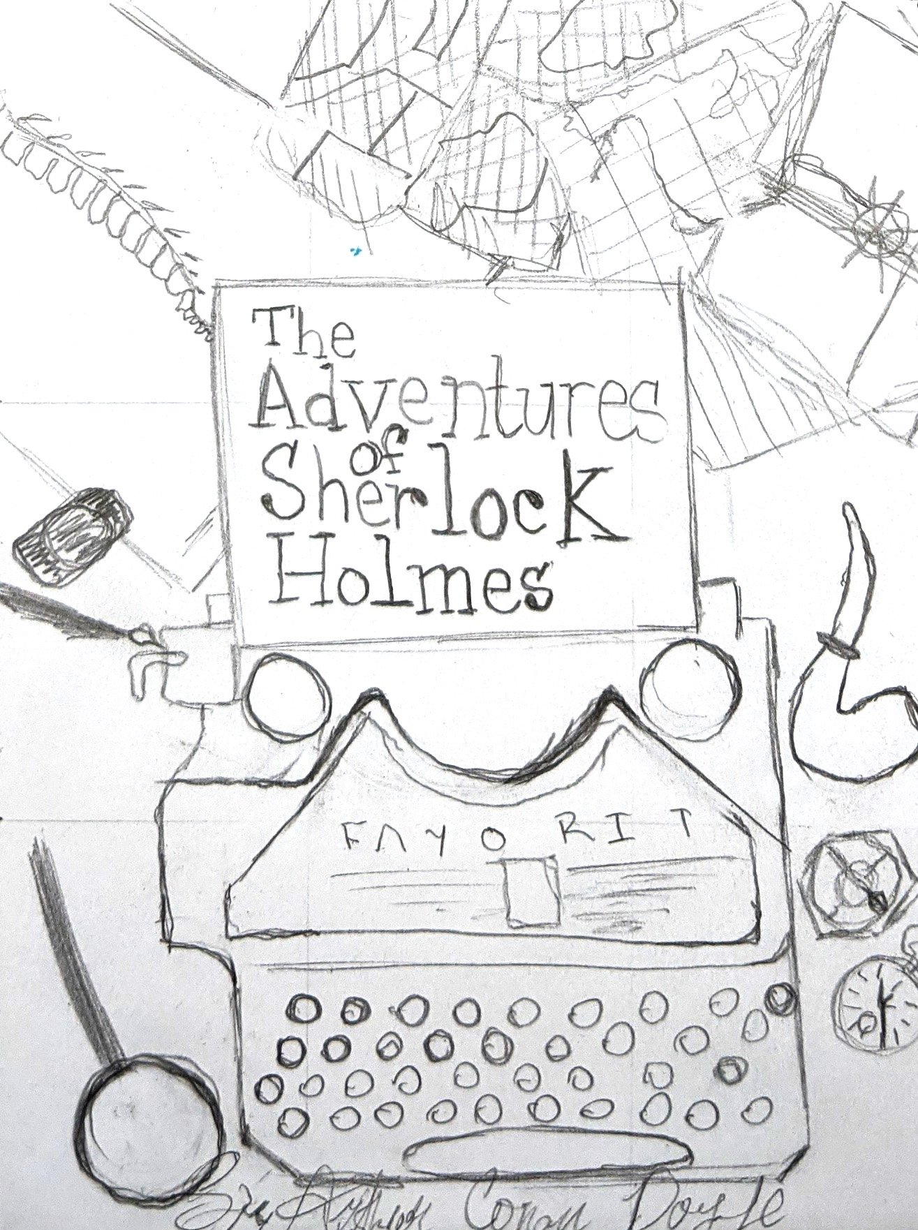
Sketches

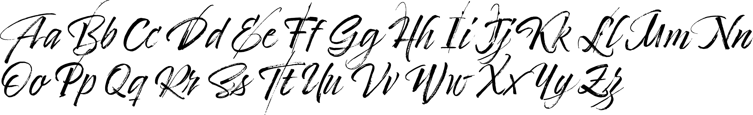
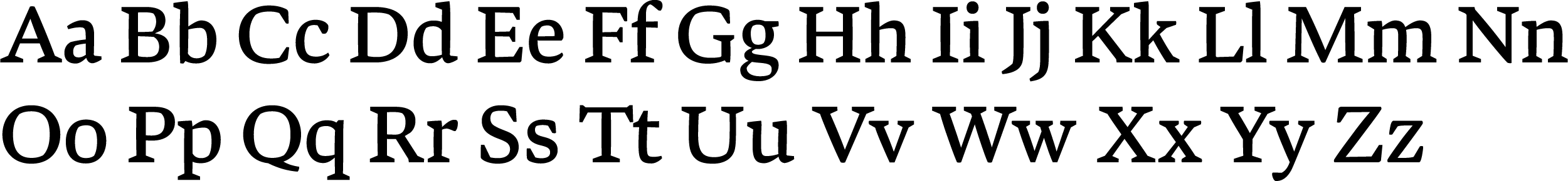
Typography
The Chandler 42 font has a vintage typewriter look that suits it well as a book title font. It gives the impression that the title was typed onto the page using a typewriter. Timberline is a stylish, handwritten font that resembles a signature. It's perfect for the author's name on a book cover, making it look like the book is signed. Bennet Text Four is a font ideal for editorial use and works well as the body copy type.
Chandler 42
Regular

Timberline
Regular
Bennet Text Four
Regular
Color Swatches
The book cover for "The Adventures of Sherlock Holmes" uses a warm orange (#F9B440) and dark reddish-brown (#491C0F) color palette, which creates an aura of mystery and sophistication that is fitting for the detective genre. The contrast with light gray (#E4E4E4) adds a dramatic effect and makes the cover elements stand out, while the use of black (#000000) gives a timeless, classic feel. Overall, the chosen color scheme effectively conveys the book's mood, genre, and themes, making it a captivating option for the cover design.
RGB 255, 180, 64
CMYK 1, 32, 85, 64
HEX #F9B440
RGB 73, 28, 15
CMYK 43, 81, 83, 66
HEX #491C0F
RGB 0, 0, 0
CMYK 75, 68, 67, 90
HEX #000000
RGB 228, 228, 228
CMYK 9, 7, 7, 0
HEX #E4E4E4
First Draft
I was pleased with the first draft of the Book Cover as it accurately depicted my envisioned sketch. The concept was to showcase the desk of Sherlock Holmes from a first-person perspective, displaying a chaotic arrangement of clues supplemented with formulas and thoughts linking the clues together.
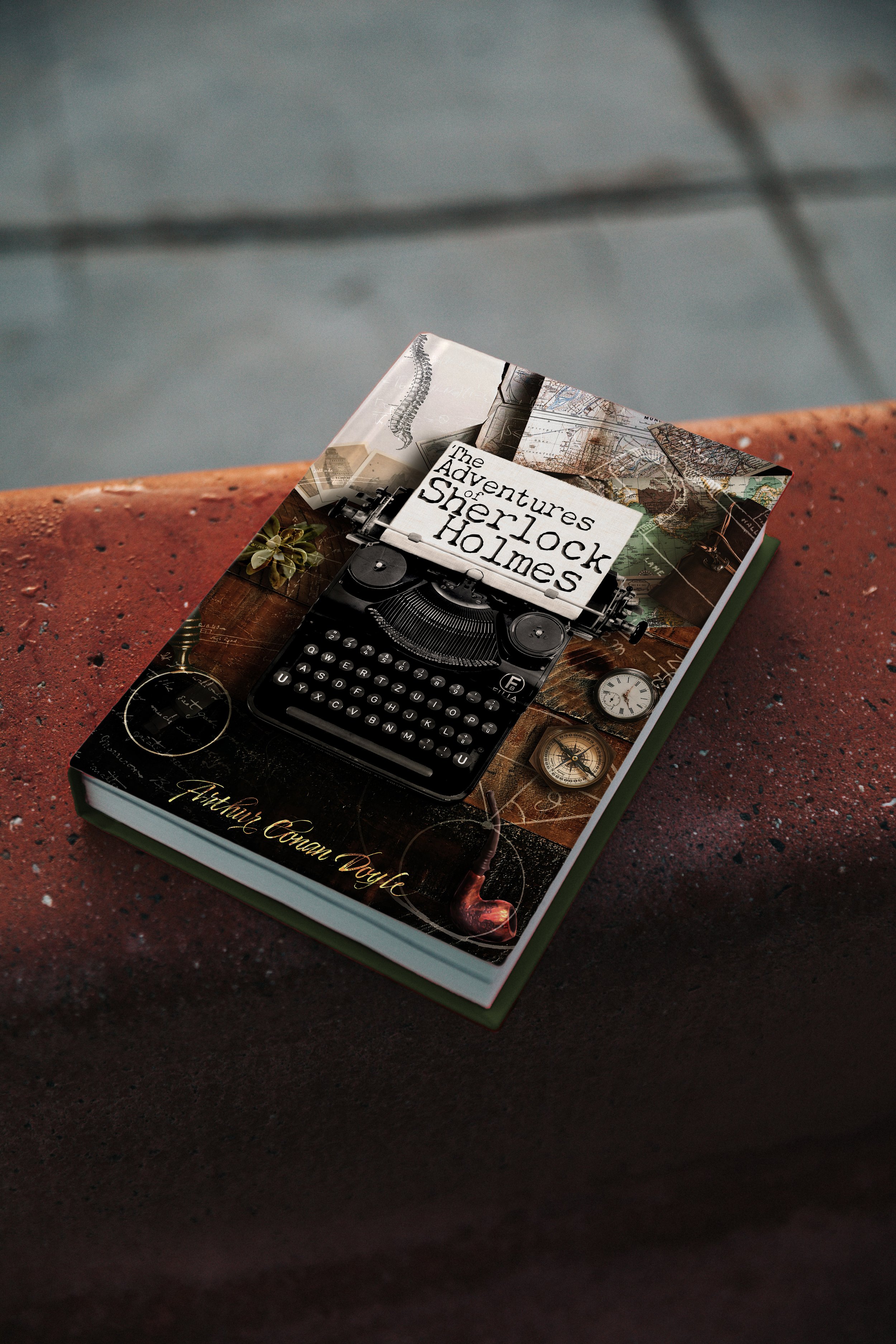
Final Draft
The Final draft improved upon the first draft by addressing the issues with scale by reducing the size of the objects in the frame. This also allowed for more of the tabletop to be visible. I applied a gold foil effect to the Author’s name to create more contrast. The remaining part of the dust jacket was designed to keep up with the first-person perspective and Sherlock's desk appearance. It also included the book's blurb, reviews, and information about the author on the back cover and inner flaps.
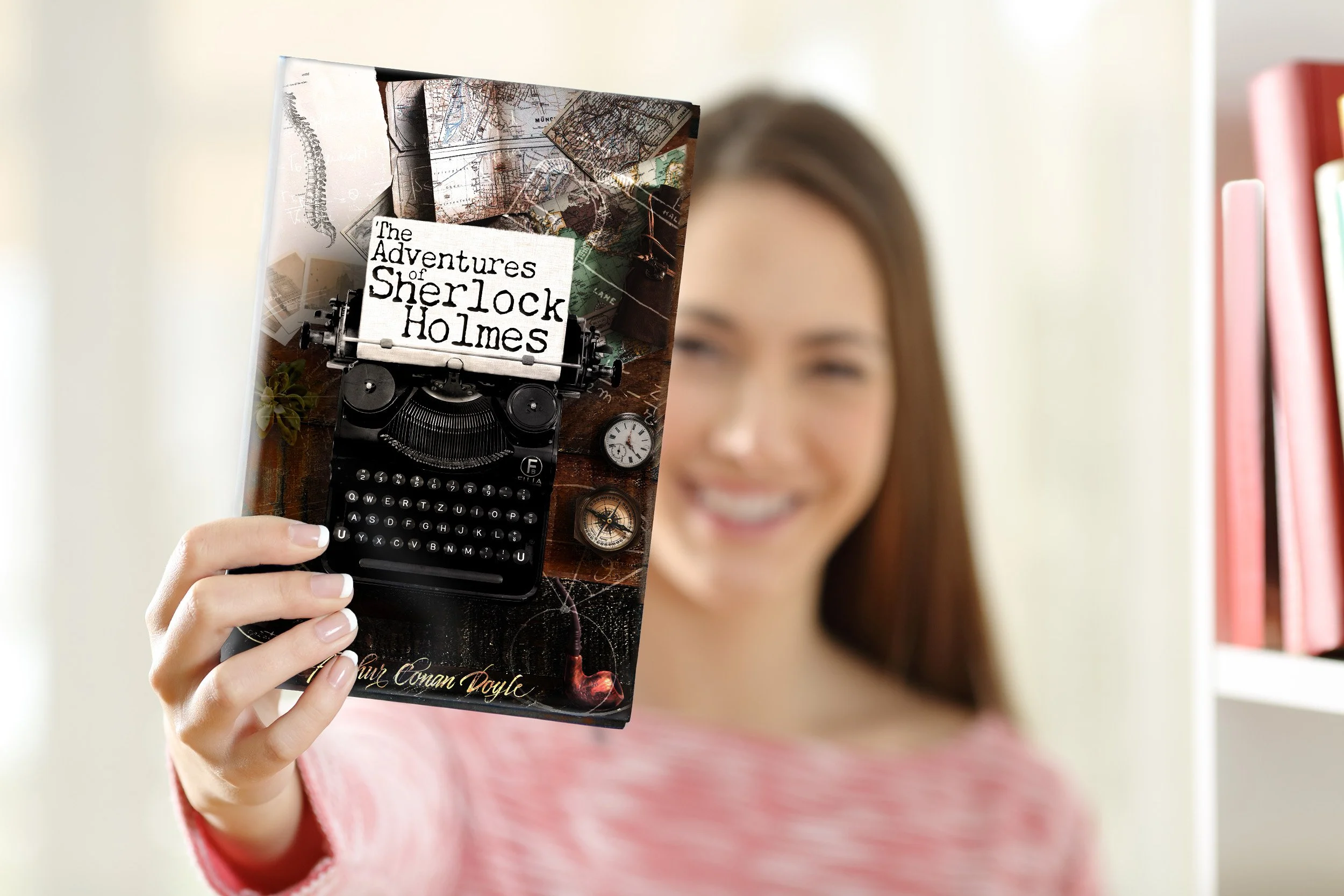
Environmental Contact
Mockups are a crucial aspect of the design process as they provide a tangible representation of the design and enhance its relatability.